

Studies
Sanderson Studies is a curated exploration of art and wine, pairing boutique New Zealand wines with the hero works from Sanderson Contemporary’s exhibitions.
You can follow along by subscribing to receive two wines monthly or a seasonal six-bottle collection below.
Each release is a study in how the energy of the wine amplifies the solid form of each artist’s hero piece.
Mica Franco x Si Rong Li
I’m exploring the dialogue between art and wine by pairing each artist’s hero piece with a wine that echoes its mood, energy, and emotion. The aim is to translate visual expression into taste, inviting viewers to experience the artwork through another sensory lens. Each match is intuitive and collaborative, celebrating both the artist’s vision and the craft of our boutique producers.
Each month, Boutique Connection supports Sanderson Contemporary Art’s exhibition openings.
This is a collaboration of wine and art pairing where we pair a handcrafted New Zealand wine with the artist’s hero piece. The project explores how taste and texture can echo a visual experience and perhaps even enhance it.
I’m exploring the non-verbal dialogue between art and wine and pairing each artist’s hero piece with a wine that echoes its mood, energy, and emotion.
The aim is to translate visual expression into taste, inviting viewers to experience the artwork through another sensory lens. Each match is intuitive and collaborative, celebrating both the artist’s vision and the craft of our boutique producers.
Si Rong Li - Nowhere, Now Here
Nowhere, Now Here is a solo exhibition by Taiwanese-born, Tāmaki Makaurau Auckland-based artist Li Si Rong, presented at Sanderson Contemporary.
Through her playful and thoughtful works, Si Rong explores ideas of belonging, memory and finding a sense of place in the world. She invites us to slow down, take notice of our surroundings and appreciate the simple moments we often overlook.
There's a lovely sense of calm throughout the exhibition, with recurring references to nature, home and the feeling of being present.
In The Air
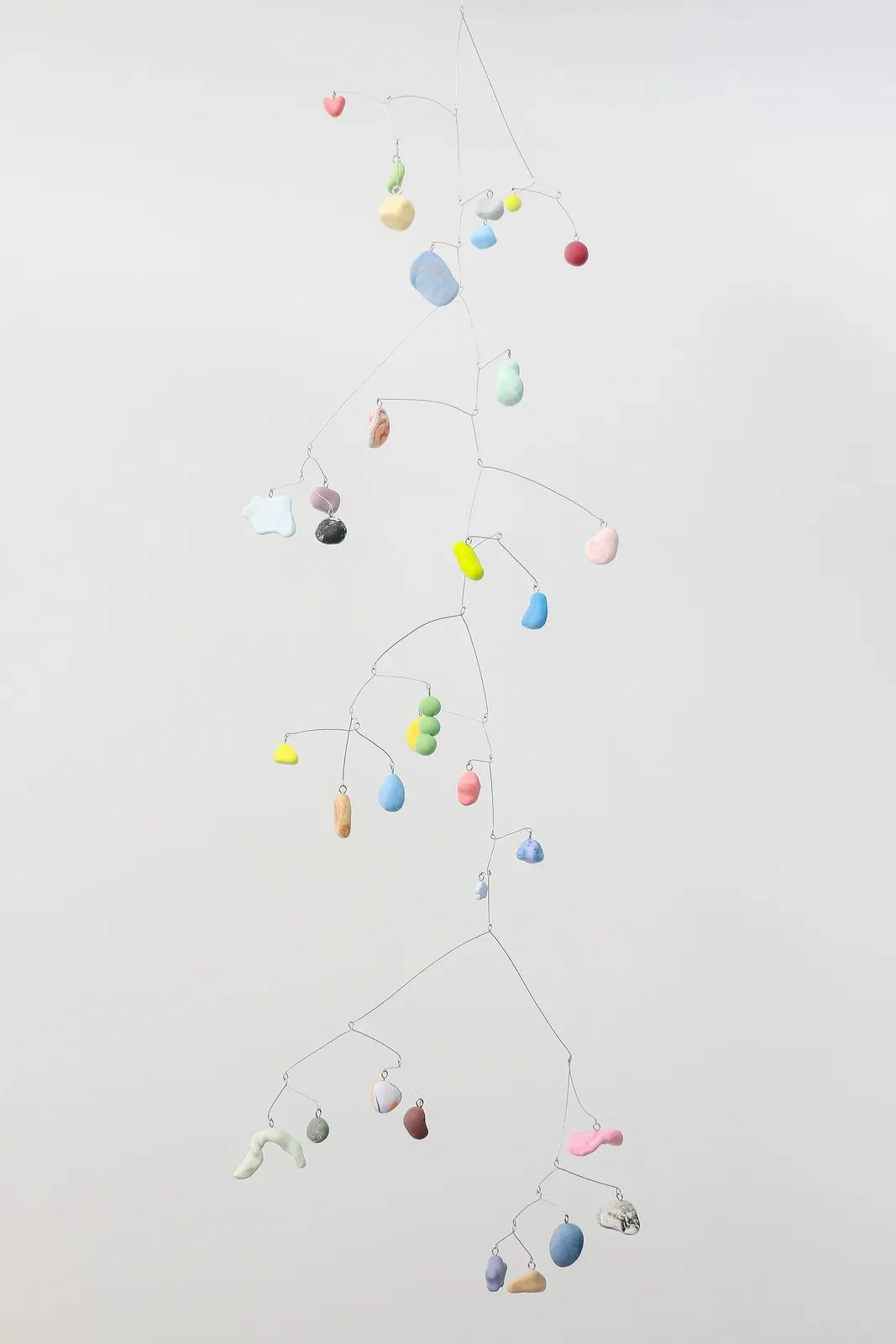
In the Air began with the idea of a bird in flight. It's a delicate mobile that hangs above us, constantly moving and finding its balance.
Si Rong likens the experience of looking at the work to gazing up at the stars. We naturally lift our heads to see it, taking a moment to stop, rest and look upwards.
There's something wonderfully playful about the work, yet also quite grounding. Despite being suspended in the air, it's all about finding balance and being present in the moment.
As Si Rong beautifully writes in her accompanying exhibition poem:
"I am beneath this field of stars. I am on the ground. I am here."
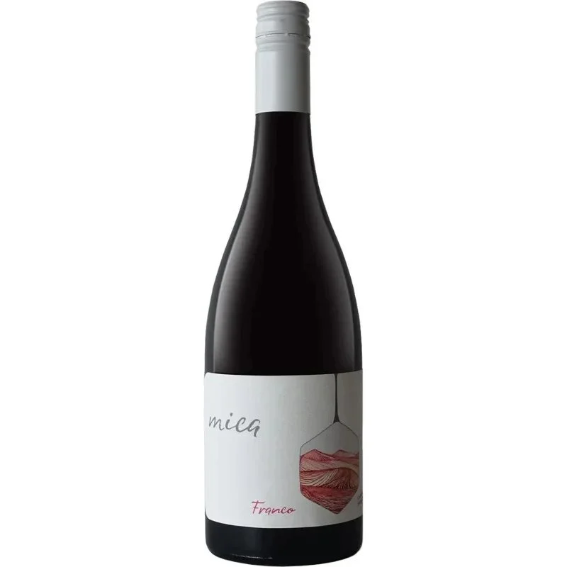
To echo this feeling, I've chosen Mica Franco Cabernet Franc 2023 from Hawke's Bay, a collaboration between winemaker friends Josephine Perry and Tamra Kelly-Washington.
Mica Franco 2023
Cabernet Franc can be quite a structured, serious red, but Franco takes a lighter, more relaxed approach. Made from fruit grown at Howell Vineyard in Bridge Pa, it's a wonderfully refreshing expression of the variety, designed to be enjoyed with a decent chill.
What I love about this pairing is the balance between lightness and earthiness.
Si Rong's mobile floats above us, gently shifting and finding its equilibrium, while Franco offers that same sense of lightness in the glass. Its bright fruit and refreshing character give it lift, while the earthy, savoury notes keep it grounded.
Both challenge our expectations a little. A red wine that doesn't feel heavy, and an artwork that hangs in the air yet reminds us to feel grounded.
“Feet on the ground, head in the air.”
Enjoy!
- Renée Dale
—
Si Rong Li
Nowhere, Now Here
16 September - 11 October 2026Sanderson are delighted to present the exhibition Nowhere, Now Here by Li Si Rong.
Here is a collection of new canvases and their spinning, suspended clay cousins by the Taiwanese-born Tāmaki Makaurau-based artist Li Si Rong – the colours cheerful and deep, the subjects familiar but focused. This is an uplifting room; indeed, there are few words that more aptly describe Li Si Rong’s practice, her outlook, and her mission than the word ‘uplifting’.
And words are a good place to start, because this show’s playfulness pervades the title, too. Nowhere, Now Here is both a mantra and a fact. An artful pairing, the phrase contains the soothing reality of the present, and it sounds like a calming conversation one might have with oneself in a moment of reflection. In this way, the title reflects Li’s observation that with this series she has moved from the communal, the focus of last year’s Murmuration, to the individual experience.
…
Read more from Amy Stewart here.
Colere x Katherine Throne
I’m exploring the dialogue between art and wine by pairing each artist’s hero piece with a wine that echoes its mood, energy, and emotion. The aim is to translate visual expression into taste, inviting viewers to experience the artwork through another sensory lens. Each match is intuitive and collaborative, celebrating both the artist’s vision and the craft of our boutique producers.
Each month, Boutique Connection supports Sanderson Contemporary Art’s exhibition openings.
This is a collaboration of wine and art pairing where we pair a handcrafted New Zealand wine with the artist’s hero piece. The project explores how taste and texture can echo a visual experience and perhaps even enhance it.
I’m exploring the non-verbal dialogue between art and wine and pairing each artist’s hero piece with a wine that echoes its mood, energy, and emotion.
The aim is to translate visual expression into taste, inviting viewers to experience the artwork through another sensory lens. Each match is intuitive and collaborative, celebrating both the artist’s vision and the craft of our boutique producers.
Katherine Throne
Katherine Throne is a contemporary painter based in Wānaka whose work is deeply inspired by the resilience, energy and beauty of the natural world. Through her works she captures not simply the appearance of flowers and gardens, but the vitality they hold.
Her paintings immerse the viewer in a world where light, movement and texture become almost tangible, inviting us to feel the lavishness of petals, the friction of stems and the energy that exists within a flourishing garden.
The Swing of Things
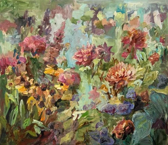
When Katherine described her hero piece, The Swing of Things, she spoke of her garden in summer happiness, where an afternoon breeze moves through the flowers while birds and insects create a constant sense of motion. The painting isn't simply about a garden; it's about the feeling of being immersed within one. There is warmth, generosity and an effortless vitality that invites you to linger.
Beneath that joy sits the quiet philosophy of her exhibition, Labour of Love. Katherine speaks of reverence for nature and for those who tend it. The garden's beauty isn't accidental; it is cultivated through patience, observation and care. The Swing of Things feels like the reward for that devotion... a fleeting moment when everything is alive, flourishing and perfectly in balance.
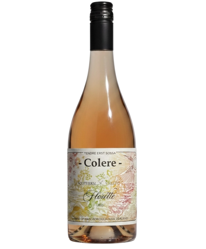
The wine immediately recalled the atmosphere of the painting for me. A blend of 60% Sauvignon Blanc and 40% Pinot Noir, Florette carries delicate floral aromatics, bright citrus and gentle summer berry fruit, all wrapped in a freshness that feels like a warm breeze moving through a garden.
Then there was the name; Florette, which evokes flowers blooming, quietly reinforcing Katherine's celebration of the garden and the beauty that comes from careful cultivation.
Knowing the vineyard is organically farmed adds another layer to the pairing. Like Katherine's garden, it is a place where biodiversity is welcomed, where insects, wildflowers and healthy soils all play their part. Both the painting and the wine celebrate the beauty that emerges when nature is given the space to flourish.
Together, the work and the wine celebrate nature in motion. Both remind us that beauty is rarely created in an instant, but through patience, care and quiet attention. They invite us to slow down, breathe deeply and savour the simple pleasure of a summer afternoon when everything feels wonderfully alive.
Enjoy!
- Renée Dale
—
Katherine Throne
Labour of Love24 June - 19 July 2026
Sanderson are pleased to present the exhibition Labour of Love featuring a new suite of paintings by Katherine Throne.
The suite of canvasses making up Labour of Love burst with botanical energy. Based on the garden that wraps around her studio, these paintings are a celebration of the garden that Wanaka-based Katherine Throne has nurtured from the thin soil in Otago.
Alongside their joyous optimism, these paintings have a definitive physicality. Like the plants she has lovingly coaxed outside, the work on display is the result of hard-won labour. The act of creating is filled with trial, error, success and failure, and yet for Throne, the urge to create is constant. The intertwining of her labour both outside and in the studio are the subject of this exhibition.
__
- Dr Penelope Jackson MNZM
Read more here.
OMEO x Lang Ea
I’m exploring the dialogue between art and wine by pairing each artist’s hero piece with a wine that echoes its mood, energy, and emotion. The aim is to translate visual expression into taste, inviting viewers to experience the artwork through another sensory lens. Each match is intuitive and collaborative, celebrating both the artist’s vision and the craft of our boutique producers.
Each month, Boutique Connection supports Sanderson Contemporary Art’s exhibition openings.
This is a collaboration of wine and art pairing where we pair a handcrafted New Zealand wine with the artist’s hero piece. The project explores how taste and texture can echo a visual experience and perhaps even enhance it.
I’m exploring the non-verbal dialogue between art and wine and pairing each artist’s hero piece with a wine that echoes its mood, energy, and emotion.
The aim is to translate visual expression into taste, inviting viewers to experience the artwork through another sensory lens. Each match is intuitive and collaborative, celebrating both the artist’s vision and the craft of our boutique producers.
Lang Ea
Lang Ea is an award winning Cambodian-born, Tāmaki Makaurau Auckland-based sculptor and multidisciplinary artist whose practice explores themes of memory, displacement, conflict, and human resilience. Having fled Cambodia with her family following the fall of the Khmer Rouge regime and later settling in Aotearoa New Zealand, Ea draws on personal experiences of migration and historical trauma to create powerful sculptural and installation works that resonate on both personal and universal levels.
In Conflict to Fusion, this series of highly polished, marine grade stainless steel sculptural works is a compelling new exhibition that examines the delicate balance between unity and separation, harmony and discord, through the simple yet profound form of a water droplet.
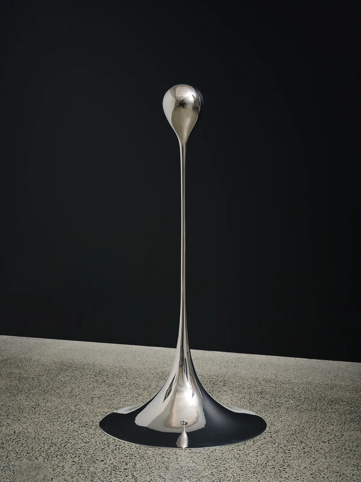
Fusion
Lang Ea's polished sculptures are elegant and fluid, yet held in moments of pause, inviting us to reflect on the ways connection can be interrupted before ultimately being restored.
When I first saw this piece, I was struck by its remarkable sense of clarity. The suspended droplet felt almost weightless, its mirrored surface constantly shifting with the light around it. There is movement, precision and stillness all at once, creating a beautiful tension between flow and inertia.
This pairing needed a wine that embodied purity and precision rather than power. Something that carried a hushed, crystalline clarity and an undeniable tension... a wine that, like the sculpture, reveals its greatest strength through elegance and poise.
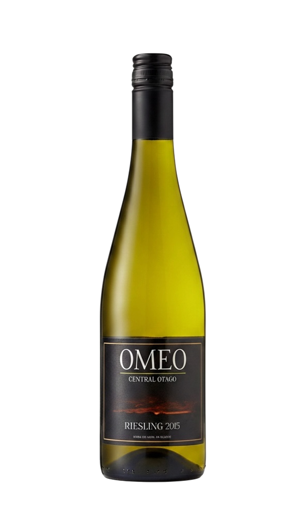
The wine I immediately thought of was a Riesling I’d tried recently. In particular, a Central Otago Riesling. Grown on a tiny 1-Ha vineyard in Alexandra, the OMEO Riesling is defined by crystalline purity, piercing acidity and stony minerality.
The wine's name adds another beautiful layer to the pairing. Named after Omeo Gully, a landscape shaped by water during Central Otago's gold rush, it speaks of a place where flowing water was diverted and redirected in the search for something precious. Like all great wines, OMEO tells the story of the land from which it comes, making water not only a feature of the wine, but part of its history.
Standing in the gallery amongst Lang's series of maquettes and finished sculptures, glass of OMEO in hand, it clicked. The glacial purity, fine minerality and gentle off-dry generosity of the Riesling seemed to awaken something in the work for me.
The sculptures almost began to sing... their highly polished surfaces catching the light with the same crystalline, high-pitched energy that the wine carried across the palate.
It was glorious - I’m really looking forward to pairing another wine to one of Lang’s future works, perhaps a completely different media next time?
Cheers,
- Renée Dale
—
Lang Ea
Conflict to Fusion24 June - 19 July 2026
Sanderson are pleased to present Fusion to Conflict, a compelling new exhibition of sculptural works by award winning sculptor Lang Ea, which examine the delicate balance between unity and separation, harmony and discord, through the simple yet profound form of a water droplet.
At the heart of the exhibition lies a powerful metaphor - the water droplet, moving unerringly along its path and inseparable from the greater body from which it comes, represents a state of fusion - a condition of fluid connection, interdependence, and harmonious existence. In nature, the droplet's journey is effortless; it belongs simultaneously to itself and to the whole.
Yet Fusion to Conflict explores what happens when this natural state is interrupted.
__
View Works here.
Colere x Mickey Smith
I’m exploring the dialogue between art and wine by pairing each artist’s hero piece with a wine that echoes its mood, energy, and emotion. The aim is to translate visual expression into taste, inviting viewers to experience the artwork through another sensory lens. Each match is intuitive and collaborative, celebrating both the artist’s vision and the craft of our boutique producers.
Each month, Boutique Connection supports Sanderson Contemporary Art’s exhibition openings.
This is a collaboration of wine and art pairing where we pair a handcrafted New Zealand wine with the artist’s hero piece. The project explores how taste and texture can echo a visual experience and perhaps even enhance it.
I’m exploring the non-verbal dialogue between art and wine and pairing each artist’s hero piece with a wine that echoes its mood, energy, and emotion.
The aim is to translate visual expression into taste, inviting viewers to experience the artwork through another sensory lens. Each match is intuitive and collaborative, celebrating both the artist’s vision and the craft of our boutique producers.
Mickey Smith
I first met Mickey Smith about two years ago at Sanderson.
Before we even started talking about art, I noticed her because she had an awesome hairstyle ... an undercut. I loved it immediately because I had one too! What started as a casual comment turned into a surprisingly emotional conversation about why we had both chosen to wear our hair that way, and the personal experiences sitting quietly underneath it.
I remember walking away from that interaction with Mickey thinking what a powerhouse. What a strong woman. What a thoughtful human. What a talent.
So when Lydia connected us again to pair a wine with Mickey’s latest exhibition, Sacrosanct, it genuinely felt like an honour. It felt less like simply matching a wine to an artwork, and more like two worlds thoughtfully coming together. It felt authentic and real, and tangible.
Untitled Vol. XII, Strahov
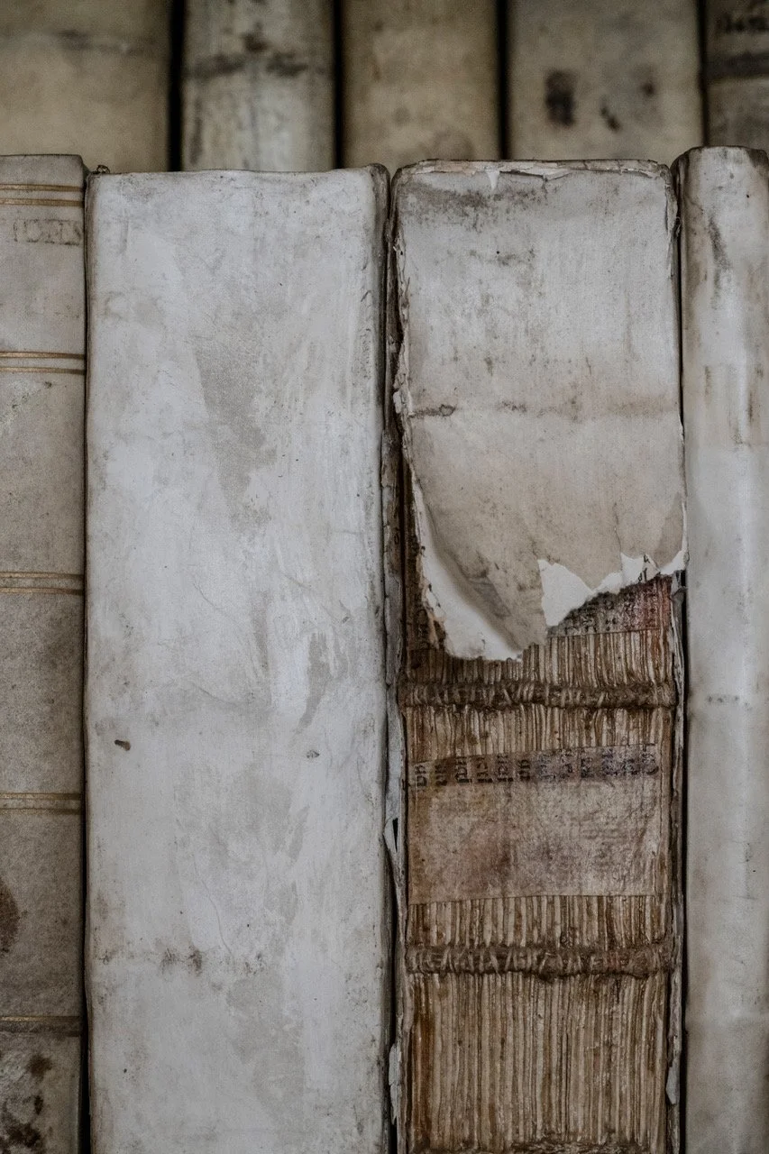
Mickey’s work explores books, archives, libraries, and the physical weight of cultural memory. For this exhibition, she photographed within Prague’s Strahov Monastery, creating images dense with texture, silence, and accumulated time. As Mickey described them, the works carry “big, gritty weight” and feel “tactile” and “dead quiet.”
When I first saw Untitled Vol. XII, Strahov, 2026, the shelves of aging books seemed to transform into something beyond objects ... part of the building itself, almost geological. The works appear musty and tactile, yet somehow preserved from decay, creating this beautiful tension between entropy and permanence.
Standing in the gallery discussing the work together, there was a shared feeling that this pairing needed to reward patience and contemplation rather than immediacy.
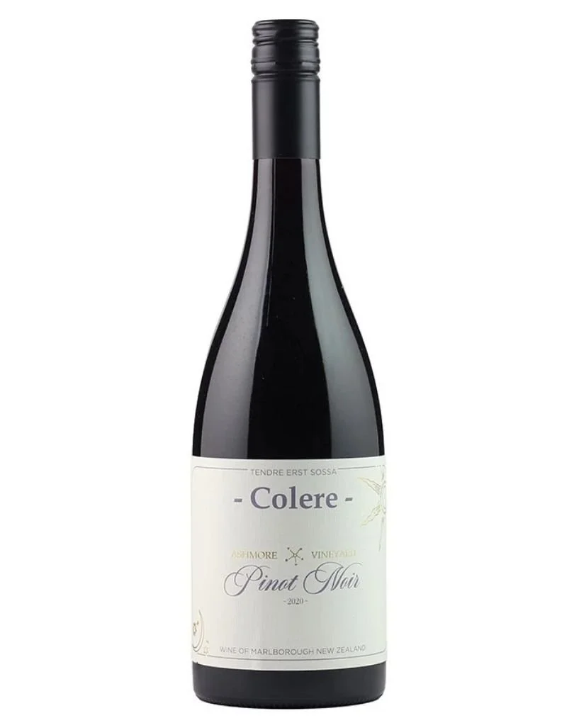
Colere - Ashmore Vineyard Pinot Noir 2020
As we discussed the work, I kept coming back to one wine ... Colere - Ashmore Vineyard Pinot Noir 2020
The wine immediately mirrored the emotional atmosphere of the piece for me. There were these autumnal, forest floor characters alongside notes that reminded me of old paper, tobacco, timber shelves, and bound leather. Emma Jenkins MW described the wine as showing “bacon fat, mocha and tobacco whole-bunch notes” alongside wild berries and pomegranate, with the 100% whole bunch fermentation adding “a little extra seasoning.”
Standing together at the gallery with the works hanging on the walls and a glass of the Colere in hand ... we all realised, this was the one.
Both the work and the wine asked for the same thing from us ... slowing down. Intention. Thoughtfulness. Time. Both unfolded through texture, detail, and emotional weight.
It was sacrosanct.
Enjoy.
- Renée Dale
—
Mickey Smith
Sacrosanct29 May - 21 June 2026
Sanderson are pleased to present the exhibition Sacrosanct
“To live means to leave traces.” - Walter Benjamin
Mickey Smith is deeply attentive to the fragility of knowledge systems, their inevitable decay and their survival. For more than two decades the American-born, Aotearoa-based artist has closely examined libraries in the US, New Zealand and the Pacific.
Now, with Sacrosanct, we see an evolution from Smith’s award-winning photographic series Volume. With this expansion on her decades-long inquiry into the physical and social significance of texts and archives, she turns her gaze to libraries cloistered in monasteries.
It is tempting to picture the artist as a young girl in 1970s Minnesota sitting among the stacks in her local library, her nose in a book. The truth is a little less tidy. Smith didn’t find herself in an academic environment until she entered university. Books, to her, were merely utilitarian. So, what drew her to a theological library in the English Midlands with 229 hand-transcribed Latin manuscripts dating back to the 12th century?
__
Read more here.
Albariño Brothers x Sarah Treadwell
I’m exploring the dialogue between art and wine by pairing each artist’s hero piece with a wine that echoes its mood, energy, and emotion. The aim is to translate visual expression into taste, inviting viewers to experience the artwork through another sensory lens. Each match is intuitive and collaborative, celebrating both the artist’s vision and the craft of our boutique producers.
Each month, Boutique Connection supports Sanderson Contemporary Art’s exhibition openings.
This is a collaboration of wine and art pairing where we pair a handcrafted New Zealand wine with the artist’s hero piece. The project explores how taste and texture can echo a visual experience and perhaps even enhance it.
I’m exploring the non-verbal dialogue between art and wine and pairing each artist’s hero piece with a wine that echoes its mood, energy, and emotion.
The aim is to translate visual expression into taste, inviting viewers to experience the artwork through another sensory lens. Each match is intuitive and collaborative, celebrating both the artist’s vision and the craft of our boutique producers.
Sarah Treadwell
Sarah Treadwell's practice explores the relationship between painting, language and material. In her work, the sea becomes more than a landscape... it becomes a surface upon which memory, place and experience are continually written and rewritten.
For Sea Texts, Sarah considers the sea as a liquid accumulation of stories, histories and imagined futures. Her paintings trace both observed inscriptions and underlying imaginary messages, where horizons become like the crease of a turning page, revealing and concealing narratives with each movement.
Working with unstretched canvas, Sarah embraces the physical qualities of the material itself. Edges fray, grids stretch and warp, light filters through, and the painting continues to respond to its environment. There is a quiet beauty in this uncertainty... an acceptance that meaning, like the sea, is always shifting.
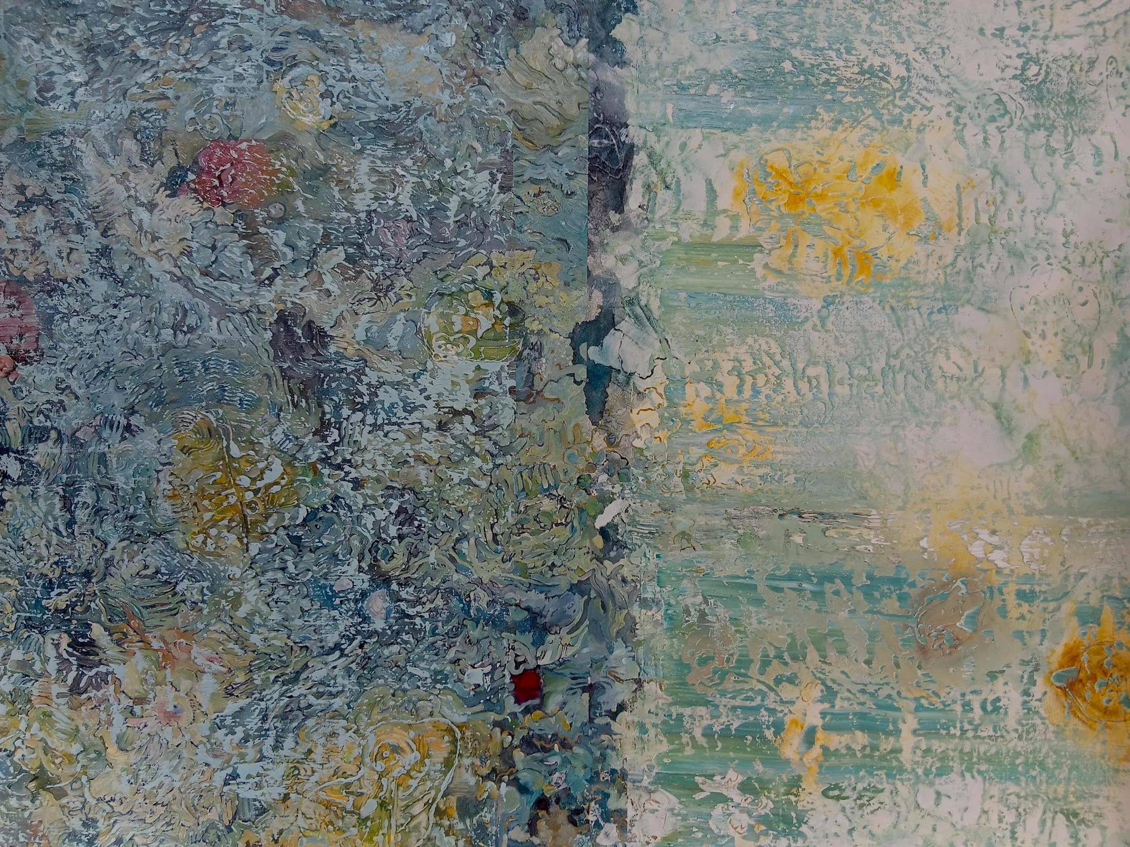
Sea Text 1, Linear Animations
When Sarah spoke to me about Sea Text 1 Linear Animations, she described lines as "uncertain or partial communication." Like pages turning in a book or tide lines left upon a beach, they repeat, but never in quite the same way.
The painting feels both architectural and organic. There is structure within the composition, yet nothing feels rigid. Instead, the work seems to breathe through subtle movement, inviting us to slow down and notice how small changes accumulate over time.
It is a work that rewards patience, just like winemaking... revealing more the longer you spend with it.
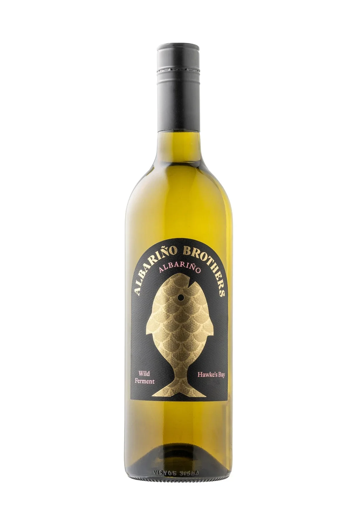
The wine immediately mirrored the character of Sarah's work for me.
The Wild Ferment Albariño is textural, saline and expressive. Wild fermentation allows the vineyard and vintage to speak with minimal intervention creating a wine that unfolds gently. Bright citrus and coastal freshness are balanced by savoury complexity and a fine phenolic texture that lingers long after each sip.
What ultimately brought the pairing together was the idea that life is never static.
Every vintage tells a different story. Every tide redraws the shoreline. Both are shaped by time, place and the subtle marks left by nature.
Like Sea Text 1 Linear Animations, this wine asks us to observe and move with the tides and to discover beauty in the quiet details that reveal themselves over time.
Enjoy!
- Renée Dale
—
Sarah Treadwell
Sea Texts27 May - 21 June 2026
Sanderson are pleased to present the exhibition Sea Texts
The title Sea Texts offers a conceptual frame through which to consider the practices of Janet Mazenier and Sarah Treadwell. In both cases, the sea operates as a field of inscription: a surface upon which memory, place, and material encounter are written and rewritten.
In Mazenier’s cold wax paintings, the sea emerges through processes of accretion, erasure, and sedimentation. Pigment is layered, scraped back, and reworked, producing surfaces that resemble tidal zones - threshold spaces where matter is continuously reconfigured. Her works read as palimpsests: gestural marks hover like half-erased scripts, suggesting that the sea itself “writes” through weather, erosion, and duration. The title Sea Texts thus resonates with her phenomenological concern for the space between - between land and water, presence and disappearance, material and memory. The sea becomes a temporal text, its surface carrying traces of atmospheric affect and lived encounter.
Treadwell’s paintings and drawings also posit the sea as a liquid accumulation of stories, hopeful projections and material uncertainty. Histories, dreams and nightmares thicken its depths and enliven the surfaces offering accounts of aquatic beginnings and future arid conditions. Treadwell’s Sea texts trace and repeat both observed inscriptions and underlying imaginary messages. Her work engages the horizon which, like the crease of a book that turns pages, in turning, cultivates the escaping narratives.
__
Read more here.
Wiese Family Wines x Stephen Ellis
I’m exploring the dialogue between art and wine by pairing each artist’s hero piece with a wine that echoes its mood, energy, and emotion. The aim is to translate visual expression into taste, inviting viewers to experience the artwork through another sensory lens. Each match is intuitive and collaborative, celebrating both the artist’s vision and the craft of our boutique producers.
Each month, Boutique Connection sponsors Sanderson Contemporary Art’s exhibition openings.
This is a collaboration of wine and art pairing where we pair a handcrafted New Zealand wine with the artist’s hero piece. The project explores how taste and texture can echo a visual experience and perhaps even enhance it.
I’m exploring the non-verbal dialogue between art and wine and pairing each artist’s hero piece with a wine that echoes its mood, energy, and emotion.
The aim is to translate visual expression into taste, inviting viewers to experience the artwork through another sensory lens. Each match is intuitive and collaborative, celebrating both the artist’s vision and the craft of our boutique producers.
Stephen Ellis
Stephen Ellis’ drawings are monochromatic, technically masterful, yet warm and nostalgic. Every object feels carefully considered, every shadow purposeful. Rather than simply depicting a scene, Stephen creates spaces filled with memory, where familiar objects invite us to reflect on the stories they carry.
For this exhibition, Undertow, Stephen continues exploring ideas of place, nostalgia, and the subtle pull of memory. They ask us to spend time looking, discovering small details that might otherwise be overlooked.
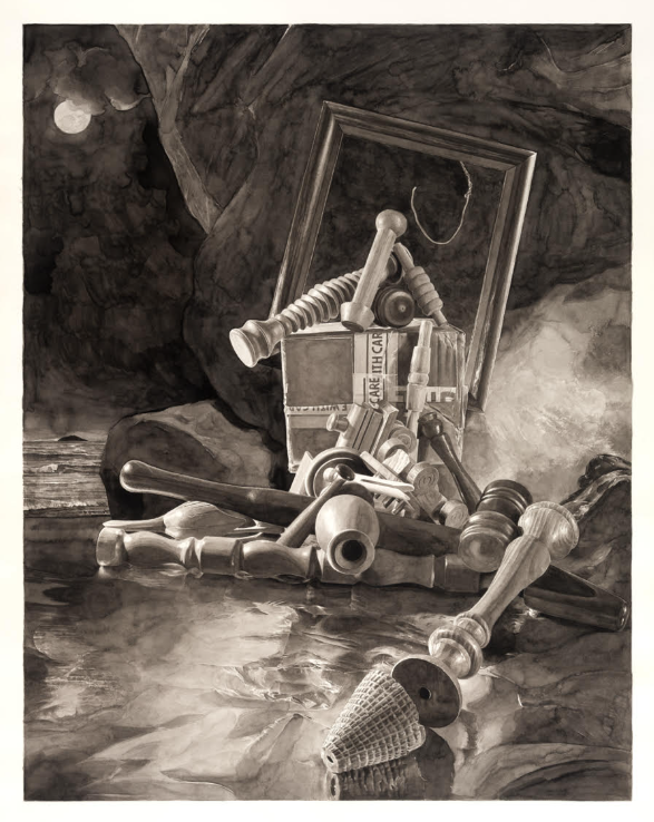
Red Boy St Clair
Stephen describes the work as "a very nostalgic piece... based on the composition of Thomas Lawrence's portrait The Red Boy or Master Charles Lambton (1825)." That connection between past and present became the starting point for the pairing.
Although the work is rendered almost entirely in lamp black and subtle tones, it never feels heavy. The familiar objects become symbols rather than possessions, each one holding fragments of memory and place.
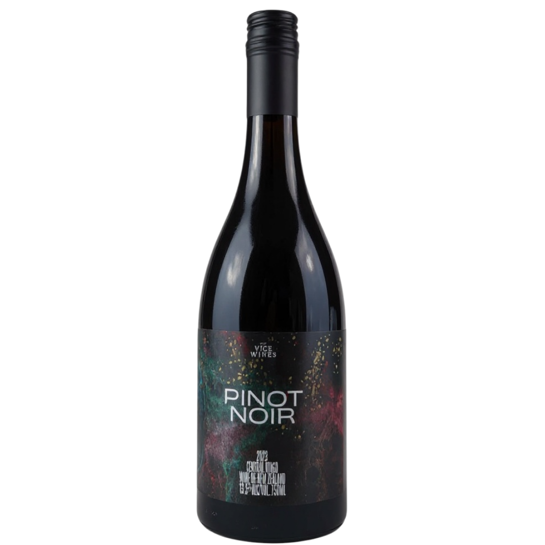
The wine comes from Wiese Family Wines in Central Otago... a young couple from two very different parts of the world... South Africa and Argentina... who fell in love with Pinot Noir in Sonoma before eventually finding home in Central Otago.
This Pinot Noir was a surprise to me. Rather than the dark, brooding fruit often associated with Central Otago, it sits in a brighter register. Think red plum, raspberry and red peach skin, carried by fine tannins that give the wine shape without weight.
Then, just as the fruit begins to settle, another layer appears... a gravitas emerges with a savoury edge and a delicate saline finish that lingers.
Stephen's drawing gradually uncovers memories hidden within ordinary objects, while the Pinot slowly builds across the palate like a moody orchestral piece... gathering depth before reaching crescendo.
There's also a shared sense of nostalgia. Stephen looks back through art history and personal memory, while the Pinot feels familiar yet unpredictable.
Enjoy!
- Renée Dale
—
Stephen Ellis
Undertow | Hvac29th April - 24th May 2026
Sanderson are pleased to present the exhibition Undertow | Hvac by Stephen Ellis.
The exhibition features a continuation of the artist’s Undertow series, as well as showcasing the beginning of an exciting new series by the artist titled ‘Hvac’.
During his 2025 residency at the Dunedin School of Art Ellis initiated the suite of drawings under the title - Undertow. The scenes in these drawings are set on Ōtepoti’s Saint Clair Beach, a formative coastal landscape from the artist’s childhood.
The brooding skies depicted quote the work of of Colin McCahon, who like the artist was born in Ōtepoti and studied at the Dunedin School of Art.
—
Read more here.
Three Fates x Yoshinaka
I’m exploring the dialogue between art and wine by pairing each artist’s hero piece with a wine that echoes its mood, energy, and emotion. The aim is to translate visual expression into taste, inviting viewers to experience the artwork through another sensory lens. Each match is intuitive and collaborative, celebrating both the artist’s vision and the craft of our boutique producers.
Each month, Boutique Connection sponsors Sanderson Contemporary Art’s exhibition openings.
This is a collaboration of wine and art pairing where we pair a handcrafted New Zealand wine with the artist’s hero piece. The project explores how taste and texture can echo a visual experience and perhaps even enhance it.
I’m exploring the non-verbal dialogue between art and wine and pairing each artist’s hero piece with a wine that echoes its mood, energy, and emotion.
The aim is to translate visual expression into taste, inviting viewers to experience the artwork through another sensory lens. Each match is intuitive and collaborative, celebrating both the artist’s vision and the craft of our boutique producers.
Shintaro & Yoshiko Nakahara
Shintaro and Yoshiko Nakahara are a collaborative artist duo whose work bridges tradition and experimentation, drawing on Japanese cultural heritage while embracing contemporary artistic influences. Working across painting, installation, and mixed media, their practice is defined by a careful balance between precision and spontaneity. Shintaro's disciplined approach to colour and form intersects with Yoshiko's intuitive, intricate ink work, resulting in pieces that feel both grounded and ethereal. Their work often explores themes of memory, impermanence, and the quiet beauty found in everyday moments.
Their collaborative practice explores how culture is carried through generations... not only in traditions and rituals, but in the small gestures, stories, and memories that shape who we are.
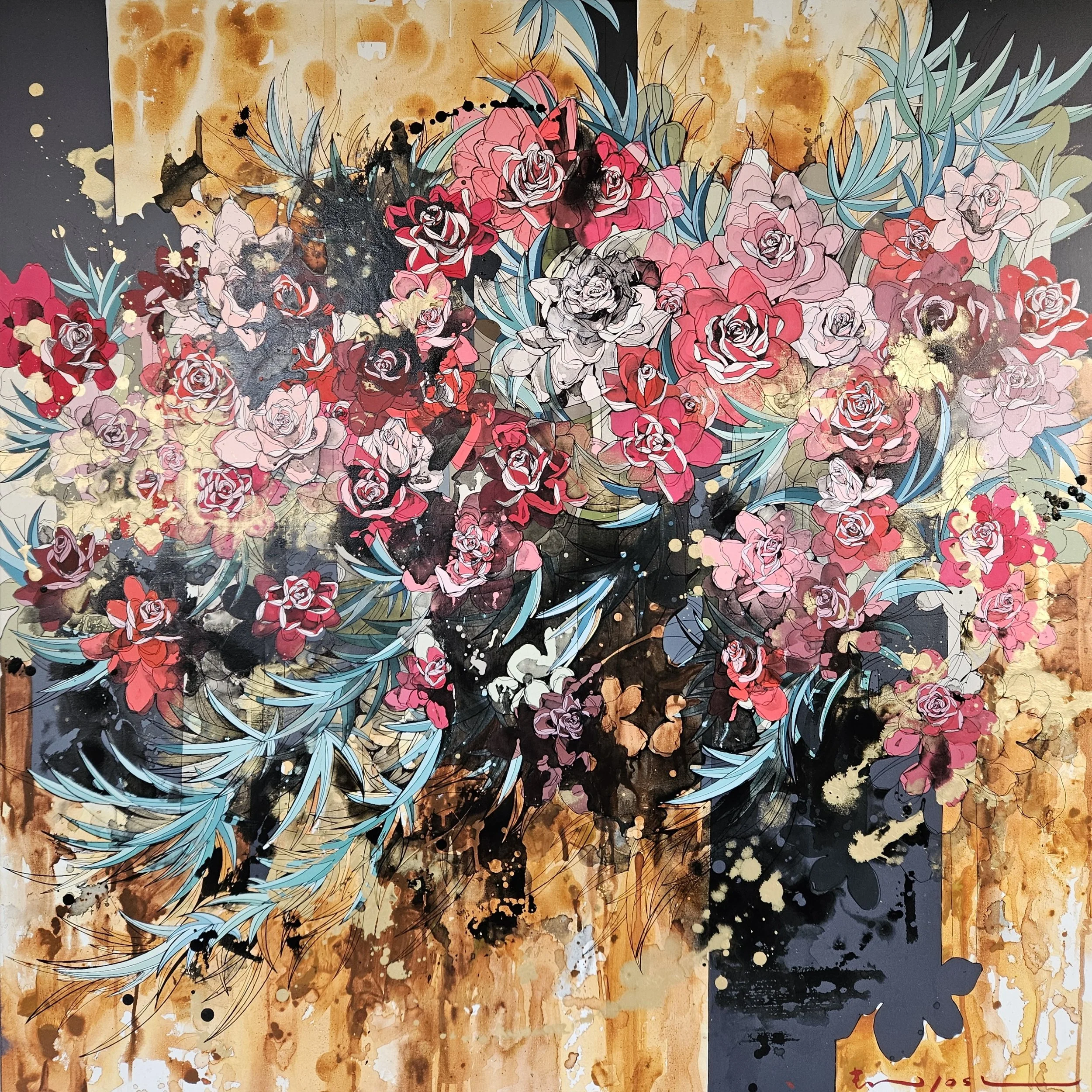
Flowing Through
Shintaro and Yoshiko's Flowing Through reflects on the beauty of heritage and how it moves through generations. As they write:
"Cultures shift and evolve, and traditions reshape themselves over time. But wherever we go, something of where we come from stays with us like a small light we carry."
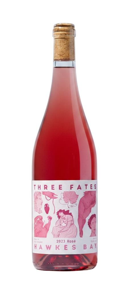
To echo Flowing Through, I've chosen to pour Three Fates Rosé for a number of reasons.
It's a brightly coloured Rosé, but importantly, it isn't sweet. Instead, it has a freshness and structure that keeps it balanced and grounded. What first drew me to it was the way it feels like it's walking between two worlds.
The fruit comes from vineyards traditionally planted for red wine. Syrah and Merlot bring depth, structure, and a sense of history, yet they're expressed here in a Rosé style that reflects how wine has evolved... more open, vibrant, fruit-driven, and refreshing.
That balance immediately reminded me of Shintaro and Yoshiko's work... heritage not as something fixed, but something that shifts and adapts over time while still holding onto its origins.
Three Fates is the collaboration of three friends, all daughters of farmers and winemakers, each carrying forward a family tradition in their own way. They honour the generations before them while creating something that feels entirely their own.
For me, that's what makes this pairing feel so natural. Both Flowing Through and Three Fates Rosé celebrate the idea that tradition isn't something we leave behind... it's something we carry with us, reshape, and pass on to the next generation.
Enjoy!
- Renée Dale
—
Shintaro & Yoshiko Nakahara
Flowing Through29th April - 24th May 2026
Sanderson are pleased to present the exhibition Flowing Through, featuring a new body of work by artist duo Shintaro and Yoshiko Nakahara.
Flowing Through is a contemplative series of paintings that reflect on the quiet, enduring nature of cultural heritage and collective memory, and the ways it can manifest across generations.
At its heart, the exhibition is an exploration of how culture is carried not only through traditions, but through subtle, intimate expressions - small gestures and shared stories. The exhibition brings together a group of works in which floral motifs serve as symbols, each bloom holding layers of memory and meaning. Roses, daffodils, lilies and mānuka, among others, are thoughtfully depicted to reflect diverse cultural identities and their unique significance.
—
Read more here.
Huntress x Paul Martinson
I’m exploring the dialogue between art and wine by pairing each artist’s hero piece with a wine that echoes its mood, energy, and emotion. The aim is to translate visual expression into taste, inviting viewers to experience the artwork through another sensory lens. Each match is intuitive and collaborative, celebrating both the artist’s vision and the craft of our boutique producers.
Each month, Boutique Connection supports Sanderson Contemporary Art’s exhibition openings.
This is a collaboration of wine and art pairing where we pair a handcrafted New Zealand wine with the artist’s hero piece. The project explores how taste and texture can echo a visual experience and perhaps even enhance it.
I’m exploring the non-verbal dialogue between art and wine and pairing each artist’s hero piece with a wine that echoes its mood, energy, and emotion.
The aim is to translate visual expression into taste, inviting viewers to experience the artwork through another sensory lens. Each match is intuitive and collaborative, celebrating both the artist’s vision and the craft of our boutique producers.
Paul Martinson
Paul Martinson’s work reflects a deep awareness of time, place, and the shifting relationship between humans and the natural world. His paintings hold the space between history and the present, drawing on both personal observation and wider environmental narratives.
There is a quiet restraint to his approach... rather than overwhelming the viewer, Paul pares things back, allowing space for reflection nad to consider what has been lost, what remains, and what continues to evolve.
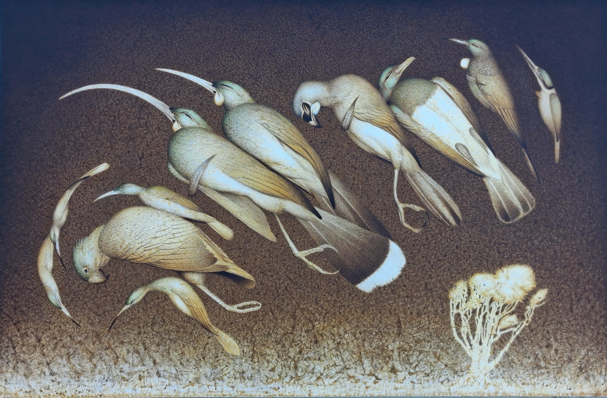
Birds in a Landscape
Birds in a Landscape is deliberately monochromatic, echoing the sepia tones of early photography. It feels like a memory... or perhaps a fragment of one, capturing a time when human settlement began to more profoundly shape the natural environment.
There is stillness in the composition, yet also an underlying sense of movement. The birds feel both present and fleeting... suspended between arrival and departure.
The work is quite shocking… both tragic and hopeful. It reflects on the temporary nature of life, where landscapes shift and species come and go. Nothing is fixed, yet everything leaves a trace.
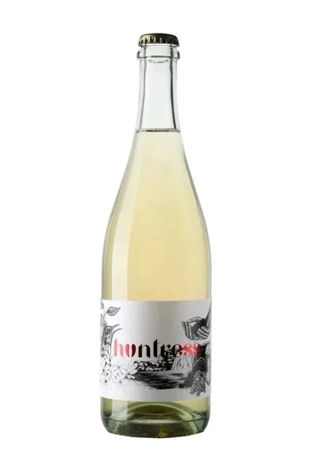
Huntress - Matiti Pétillant Naturel
Huntress Matiti Pétillant Naturel is a wine that embraces both the past and the present. Made using an ancient method, it captures fermentation in motion... bottled before it fully finishes, resulting in a lightly sparkling wine that feels alive, textural, and gently untamed.
What makes it such a natural pairing with Birds in a Landscape is this shared sense of time and transition. The painting looks back with quiet reflection, while the wine carries that same idea forward... an old method rediscovered, evolving in a modern context.
There is no heavy hand here... just nature. A reminder that life, much like the wine and the work, is always in motion.
- Renée Dale
—
Paul Martinson
Transition1 - 24 April 2026
Sanderson are pleased to present the exhibition Transition by Aotearoa New Zealand environmental painter Paul Martinson.
Transition is a thought-provoking exhibition that pairs science-informed imagery with a lifetime spent observing Aotearoa’s natural world. Through paintings that speak to the archipelago’s beauty and its profound ecological losses, Transition invites viewers to reflect on how human arrival has re-shaped forest and bird life, and the very soundscape of Aotearoa’s bush.
Aotearoa New Zealand’s archipelago - a cluster of hundreds of relatively small islands at the bottom of the planet - bears a lamentable distinction. It is often described as the bird extinction capital of the world, with more than one quarter of all human-caused bird extinctions worldwide occurring here.
A painter’s lens on science and place - Martinson’s practice bridges empirical insight with the intimate experience of years spent observing New Zealand’s flora and fauna. The exhibition explores how scientific understanding informs our grasp of ecosystems while recognizing the personal, sensory and surreal experience of place—the textures of leaves, the hush of a dawn, and the enduring music that remains only as memory in the wake of extinction.
A central and ongoing motif in Martinson’s works is the Huia - a dark greenish monarch of the forest that once heralded the dawn chorus with its flute-like song. The works render the huia as a powerful symbol of both loss and reverence, acknowledging shared responsibility across Māori and European histories for the species’ decline while honoring a collective love for this iconic songster across generations.
__
Read more here.
Mora x Jon Tootill
I’m exploring the dialogue between art and wine by pairing each artist’s hero piece with a wine that echoes its mood, energy, and emotion. The aim is to translate visual expression into taste, inviting viewers to experience the artwork through another sensory lens. Each match is intuitive and collaborative, celebrating both the artist’s vision and the craft of our boutique producers.
Each month, Boutique Connection supports Sanderson Contemporary Art’s exhibition openings.
This is a collaboration of wine and art pairing where we pair a handcrafted New Zealand wine with the artist’s hero piece. The project explores how taste and texture can echo a visual experience and perhaps even enhance it.
I’m exploring the non-verbal dialogue between art and wine and pairing each artist’s hero piece with a wine that echoes its mood, energy, and emotion.
The aim is to translate visual expression into taste, inviting viewers to experience the artwork through another sensory lens. Each match is intuitive and collaborative, celebrating both the artist’s vision and the craft of our boutique producers.
Jon Tootill
Jon Tootill’s works are not about capturing a fixed moment, but about watching … how colour shifts, how light moves, how the eye travels across a surface. There’s a patience to his process, a willingness to sit with the work and let it evolve.
Rather than directing the viewer, Jon creates space for interpretation. His pieces feel alive, inviting you to notice how your own perception changes over time.
“Rooted in his countryside life over the last 15 years, Tootill traces how changing seasons shape perception, colour, and form.“ - Sanderson Contemporary Art Gallery
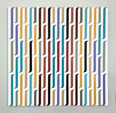
Harakeke
Harakeke (XIII) draws from the familiar form of flax, yet moves beyond representation into something more sensory. Vertical lines pull the eye upward, creating a sense of lift and quiet momentum.
At first glance, the colours feel vibrant and immediate … playful, even … but as you sit with it, a more contemplative energy emerges. The interplay of light and tone creates subtle shifts, like watching colour breathe.
It’s a piece that tells the story of spontaneity and stillness … much like a thought that appears suddenly, then deepens the longer you hold it.
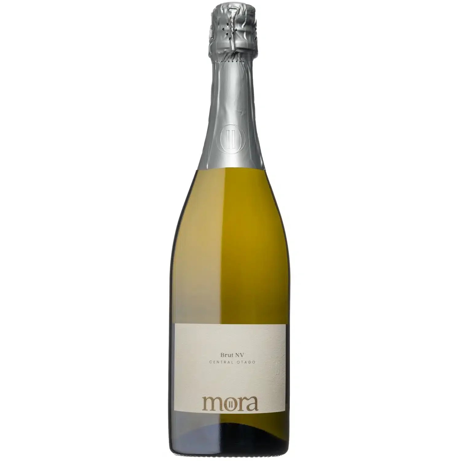
Mora - Brut NV
Mora Brut NV is a Methode Traditionelle sparkling wine from Central Otago, shaped as much by time as by intention. Fine bubbles rise steadily through the glass, creating a gentle vertical lift, while layers of citrus, brioche, and mineral texture build beneath.
What makes it such a natural pairing with Harakeke (XIII) is this shared sense of movement and evolution. The wine meets you with brightness and energy at first … much like the initial impact of the painting … before settling into something more textural and reflective.
The fine mousse mirrors the upward motion of the work, while the quiet complexity beneath speaks to the time spent observing, adjusting, and allowing something to fully reveal itself.
- Renée Dale
—
Jon Tootill
Harakeke1 - 24 April 2026
Sanderson are pleased to present Harakeke by Jon Tootill - the artist’s latest exhibition marking his 75th year.
With a bold meditation on the seasonal colours of Aotearoa, this new body of work continues the artist’s intimate exploration of his immediate environment; mapping the colours of native flora and fauna that live outside his Karaka home and studio.
The focus of the show is the Harakeke (New Zealand Flax), a recurring subject for the artist since 2020, whose graphic forms and vibrant palettes anchor the exhibition’s dialogue between landscape, lineage, and abstraction.
Rooted in his countryside life over the last 15 years, Tootill traces how changing seasons shape perception, colour, and form. His artworks celebrate Aotearoa’s flora and fauna that colour the landscape at different times of year, translating botanical observations into a painterly language.
The artist's Ngāi Tahu heritage and whakapapa are inherent in these works - the exhibition continuing his integration of cultural motifs into a contemporary visual language:
__
Read more here.
Marathon Downs x Damien Kurth
I’m exploring the dialogue between art and wine by pairing each artist’s hero piece with a wine that echoes its mood, energy, and emotion. The aim is to translate visual expression into taste, inviting viewers to experience the artwork through another sensory lens. Each match is intuitive and collaborative, celebrating both the artist’s vision and the craft of our boutique producers.
Each month, Boutique Connection sponsors Sanderson Contemporary Art’s exhibition openings.
This is a collaboration of wine and art pairing where we pair a handcrafted New Zealand wine with the artist’s hero piece. The project explores how taste and texture can echo a visual experience and perhaps even enhance it.
I’m exploring the non-verbal dialogue between art and wine and pairing each artist’s hero piece with a wine that echoes its mood, energy, and emotion.
The aim is to translate visual expression into taste, inviting viewers to experience the artwork through another sensory lens. Each match is intuitive and collaborative, celebrating both the artist’s vision and the craft of our boutique producers.
Damien Kurth
There’s something quietly magnetic about Damien Kurth’s work.
At first glance, you’re looking at masking tape, paper, foil, bottles - everyday objects arranged with care. This new body of work continues Kurth’s exploration of the still life tradition, but not in a nostalgic way. He’s using it as a framework to ask something deeper.
He’s interested in the idea of haecceity… the qualities that make something uniquely and unmistakably what it is. It’s a philosophical concept, but in his hands it feels intuitive. We all know that feeling: when an object holds presence beyond its function. When it feels like more than the sum of its parts.
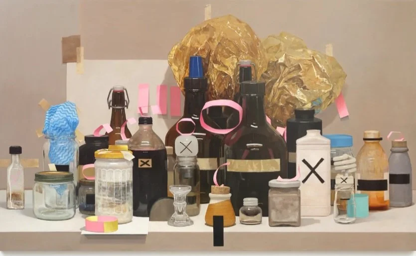
Murmur
Damien:
“At certain times I may describe it as : a bright, colorful assemblage of the known and unknown, working together, building a platform to open up future re-interpretation of the fundamentals.”
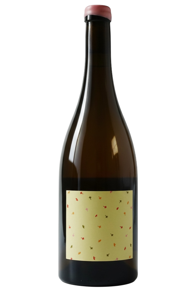
Marathon Downs - Marlborough Syrah/Viognier 2024
The wine paired with Murmur was the Marathon Downs - Marlborough Syrah/Viognier 2024.
Marathon Downs is a small-batch, family-farmed producer based in the Awatere Valley, Marlborough, New Zealand, crafting wines with a focus on thoughtful expression and minimal intervention.
Their Last Dance Syrah/Viognier is a co-fermented blend of 95 % Syrah and 5% Viognier. All hand-picked fruit that spends time in neutral oak, offering floral lift, savoury herb notes, and a textured, expressive palate.
This wine aligns beautifully with Damien’s work because both are assemblages of distinct elements that remain individual yet harmonise into a coherent whole. The Syrah provides structure, depth and a cool-climate savoury edge; the Viognier lifts the aromatics and brings a subtle brightness. Just as his compositions balance structure and play, shadow and light, this wine balances weight and lift - creating a tasting experience that feels layered, thoughtful and alive in the moment.
- Renée Dale
—
Damien Kurth
Murmur4th - 29th March
Sanderson are pleased to present the exhibition Murmur by Damien Kurth.
In this new body of work, Kurth continues to interrogate philosophical concerns within the tradition of the still life genre.
Through his chosen modality, the artist explores the concept of haecceity - the properties or qualities that make something uniquely what it is. This notion gestures toward a universal truth or essential understanding of an object, one that language may struggle to articulate.
Within Kurth’s images, the essence of his chosen objects is preserved in a poetic stillness. He arrests the haecceity of the seemingly mundane through his unique arrangements of inanimate and delicately lit objects. The assemblances take on new forms and meaning, each individual piece presenting unique characteristics.
—
Read more here.
Grava x Briana Jamieson
I’m exploring the dialogue between art and wine by pairing each artist’s hero piece with a wine that echoes its mood, energy, and emotion. The aim is to translate visual expression into taste, inviting viewers to experience the artwork through another sensory lens. Each match is intuitive and collaborative, celebrating both the artist’s vision and the craft of our boutique producers.
Each month, Boutique Connection sponsors Sanderson Contemporary Art’s exhibition openings.
This is a collaboration of wine and art pairing where we pair a handcrafted New Zealand wine with the artist’s hero piece. The project explores how taste and texture can echo a visual experience and perhaps even enhance it.
I’m exploring the non-verbal dialogue between art and wine and pairing each artist’s hero piece with a wine that echoes its mood, energy, and emotion.
The aim is to translate visual expression into taste, inviting viewers to experience the artwork through another sensory lens. Each match is intuitive and collaborative, celebrating both the artist’s vision and the craft of our boutique producers.
Briana Jamieson
For this exhibition, Briana Jamieson turned to the community garden she has been tending in Te Whanganui-a-Tara. What began as growing flowers became an exploration of calm, awe and generosity. She speaks of planting large drifts of the same flower, watching them glow in the sunlight, picking armfuls to share with others, and dreaming of growing flowers for everyone to take home. Those simple moments became the essence of these paintings.
Briana paints from a place of emotion, drawing on real experiences, memories, photographs and poetry to create works that feel both deeply personal and quietly universal.
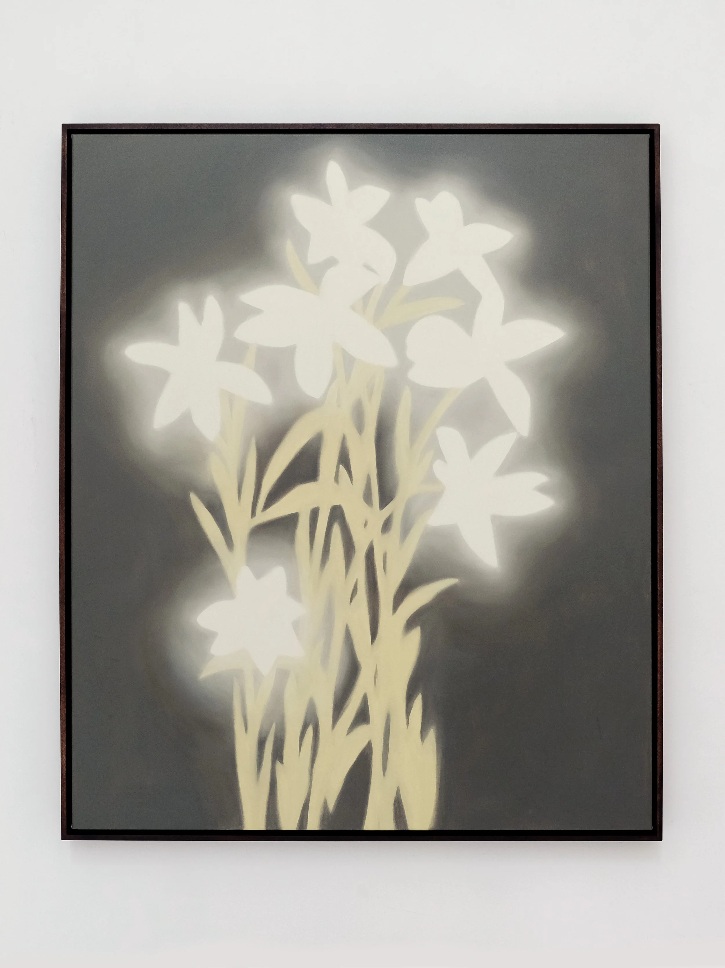
Rain Lilies (Gold)
Rain Lilies (Gold) was her chosen ‘hero’ piece and it immediately took my breath away. Inspired by the flowers Briana grows in her local community garden, the painting captures that fleeting moment when large clusters of soft white blooms catch the sunlight and seem to glow from across the garden.
What I love is that this isn't simply a painting of flowers... it's a painting of a feeling. Briana speaks of the calmness and awe she experiences when surrounded by these gardens, where delicate blooms sway gently yet feel full of life. That emotional response sits at the heart of the work.
There is a warmth running through the painting, balanced by a subtle sense of mystery. Light and shadow coexist effortlessly, creating depth without heaviness. It feels peaceful, luminous and contemplative all at once... inviting you to pause, breathe, and simply enjoy the moment.

To accompany Rain Lilies (Gold), I chose Grava Riesling.
This is a Riesling that feels beautifully precise. Bright citrus and orchard fruit bring clarity and freshness, while a few years of bottle age have begun to reveal delicate tertiary notes that add warmth without losing its crystalline character.
There's something almost weightless about it. The acidity is vibrant and pure, reminding me of cool mountain air at night, while those gentle toasty notes quietly echo the burnt butter and black sesame flavours Briana imagined alongside the work.
The Riesling refreshes before unfolding layers of texture and age. Together they create a conversation between warmth and freshness, delicacy and structure.
Like Briana's flower gardens, both celebrate the beauty found in noticing light, atmosphere and the quiet moments that often pass us by.
Enjoy!
- Renée Dale
—
Briana Jamieson
Garden Day4th - 29th March
Sanderson are pleased to present the exhibition Garden Day by Briana Jamieson.
Over the last year, Te Whanganui-a-Tara based painter Briana Jamieson has been growing flowers in a plot at her local community garden. This exhibition is inspired by days at this garden.
“I have noticed I am drawn to planting large areas of one type of flower in this garden, in the same way I am drawn to painting the same flower multiple times in a row. Golden shungiku flowering over winter and spring; tall stems of pearl matricaria in summer. This type of planting gives me a sense of awe and calm. When viewed from a distance, across the plots, the clustered together flowers glow in the sunlight.
—
Read more here.
Amoise x Julia Holderness
I’m exploring the dialogue between art and wine by pairing each artist’s hero piece with a wine that echoes its mood, energy, and emotion. The aim is to translate visual expression into taste, inviting viewers to experience the artwork through another sensory lens. Each match is intuitive and collaborative, celebrating both the artist’s vision and the craft of our boutique producers.
Each month, Boutique Connection sponsors Sanderson Contemporary Art’s exhibition openings.
This is a collaboration of wine and art pairing where we pair a handcrafted New Zealand wine with the artist’s hero piece. The project explores how taste and texture can echo a visual experience and perhaps even enhance it.
I’m exploring the non-verbal dialogue between art and wine and pairing each artist’s hero piece with a wine that echoes its mood, energy, and emotion.
The aim is to translate visual expression into taste, inviting viewers to experience the artwork through another sensory lens. Each match is intuitive and collaborative, celebrating both the artist’s vision and the craft of our boutique producers.
Julia Holderness
Julia Holderness sits at the intersection of art, history, and imagination. Through sculpture, textiles, ceramics, photography, and installation, she explores the stories we inherit and the ones we choose to create, blurring the boundaries between fact and fiction. Her work invites us to reconsider how memory, archives, and everyday objects shape our understanding of the past, revealing that history is often as much an act of interpretation as it is of preservation.
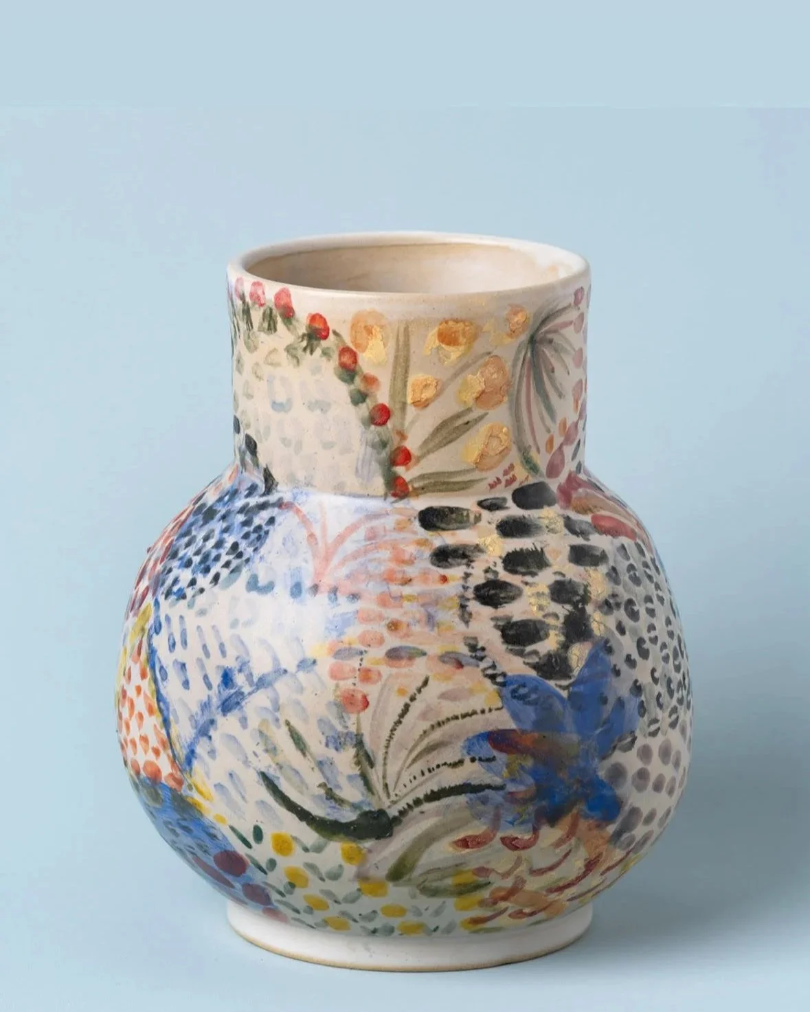
Aster
Julia described her hero piece Aster, as:
“reassuringly domestic but quietly radical in its reclaiming of craft and feminine creativity".
The wine I’ve chosen reflects that tenderness: textural and comforting, with a nostalgic warmth and nurturing feeling. It’s a wine that feels familiar and homely, much like Aster itself… a reminder that the simplest memories often hold the deepest emotional weight.
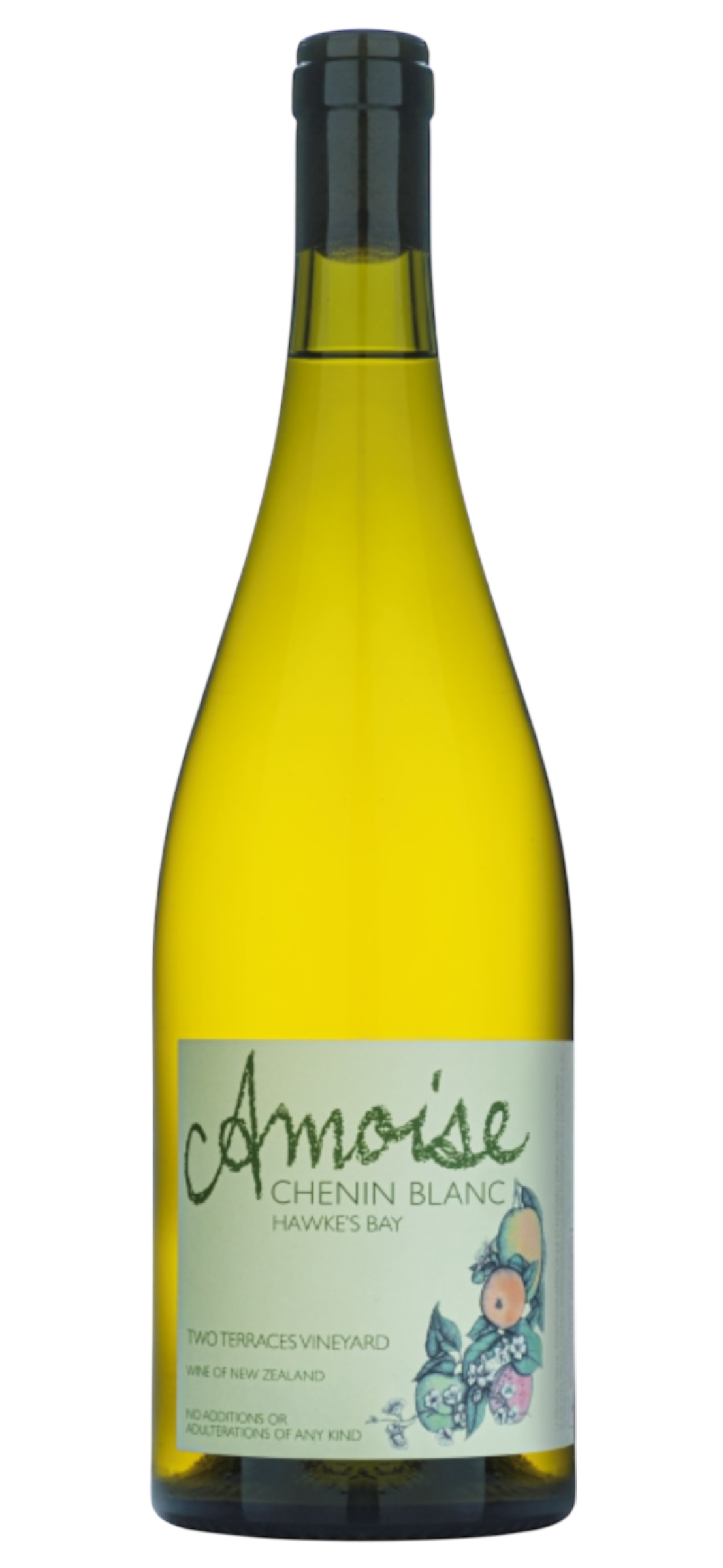
I immediately thought of the Amoise Chenin Blanc 2024 - a wine that feels equally familiar yet quietly radical in its craft. Chenin Blanc is a wine that is synonymous with apple skin. There’s something deeply domestic and familiar about its flavour. Could there be anything more nostalgic than helping mum to peel granny smiths for an apple stew, and nibbling on the skins? Simple moments that carry both nostalgia and warmth.
Amoise Chenin Blanc 2024 is a wine that carries a sense familiarity. There is something warm, domestic, and deeply human about it. Chenin Blanc is synonymous with apple skin: that simple, nostalgic flavour of helping nana peel Granny Smiths for a stew, nibbling the curls of green as if it was a daughter’s quiet duty. It’s humble, textural, and full of memory.
Amoise embraces that same honest craft. Foot-crushed fruit, a vineyard-born pied de cuve starter, and a low-intervention approach give the wine a gentle texture that mirrors the hand-made world Julia creates.
Winemaker Amy Farnsworth works with a kind of radical sensitivity herself: minimal sulphites, natural ferment, and techniques that can be risky if mishandled yet in her hands, they become quietly brilliant.
Like ‘Aster’, the wine feels both familiar and inventive, rooted in tradition yet confidently its own.
- Renée Dale
—
JULIA HOLDERNESS The Room at Ashenby
11th Nov - 7th Dec 2025
Opening - Thursday 13th November, 5.30-6.30pmSanderson are pleased to present the exhibition The Room at Ashenby, featuring a new body of works by Julia Holderness.
In her latest exhibition at Sanderson, Holderness presents a collection of new ceramics alongside selected watercolours from her studio archive — a space hovering between memory and invention. The scene feels familiar yet faintly out of time, like a quiet corner from Monk’s House or Charleston; filled with vessels, books, painted furniture, and soft afternoon light. Decoration of the vases and hand-painted tiles becomes both reverie and research — a way of thinking through pattern, colour, and form. In their company, The Room at Ashenby becomes a site for imagination and memory: to settle, rearrange itself, and set out again.—
Read more here.
VILAURA x Ray Haydon
I’m exploring the dialogue between art and wine by pairing each artist’s hero piece with a wine that echoes its mood, energy, and emotion. The aim is to translate visual expression into taste, inviting viewers to experience the artwork through another sensory lens. Each match is intuitive and collaborative, celebrating both the artist’s vision and the craft of our boutique producers.
Each month, Boutique Connection supports Sanderson Contemporary Art’s exhibition openings.
This is a collaboration of wine and art pairing where we pair a handcrafted New Zealand wine with the artist’s hero piece. The project explores how taste and texture can echo a visual experience and perhaps even enhance it.
I’m exploring the non-verbal dialogue between art and wine and pairing each artist’s hero piece with a wine that echoes its mood, energy, and emotion.
The aim is to translate visual expression into taste, inviting viewers to experience the artwork through another sensory lens. Each match is intuitive and collaborative, celebrating both the artist’s vision and the craft of our boutique producers.
Ray Haydon
Ray Haydon is a contemporary New Zealand artist whose work explores form, movement, and emotional energy through abstraction. His practice is intuitive and expressive, often inviting the viewer to experience feeling before meaning.
I met Ray over a year ago, but I had never seen his work out in the wild before! It wasn’t until 2025 that I noticed one of his elegant works appear on New Zealand’s Best Homes with Phil Spencer (Season 2, Episode 1). Featured in the Hahei House designed by Paul Clarke of Studio2, Ray’s sculpture feels almost inseparable from the timber architecture almost as though it belongs to the house itself. While I was disappointed that Phil didn’t pause to acknowledge the piece, I felt a quiet thrill in recognising it instantly as Ray’s work.
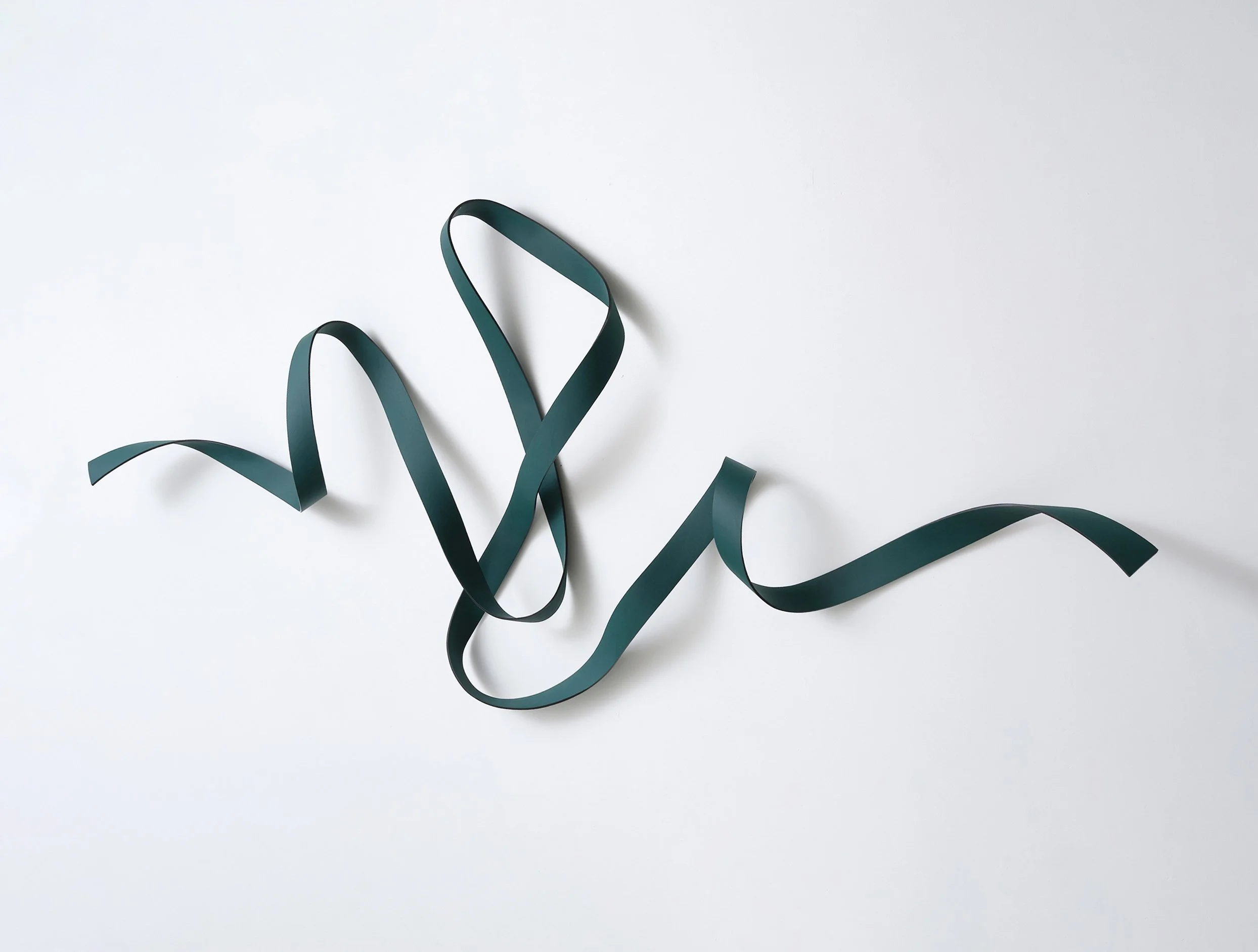
Spring
Spring has a sense of lift and release in the work and is a visual expression of freedom and optimism. Ray has spoken about his enthusiasm for green as a new colour when creating the piece, a sense of freshness.
The work feels alive… buoyant.
It doesn’t sit heavily in a space; instead, it draws the eye upward, suggesting growth, motion, and the promise of something new. When asked to translate the work into another sense, Ray, a man of few words, promptly described it like drinking champagne… effervescent.
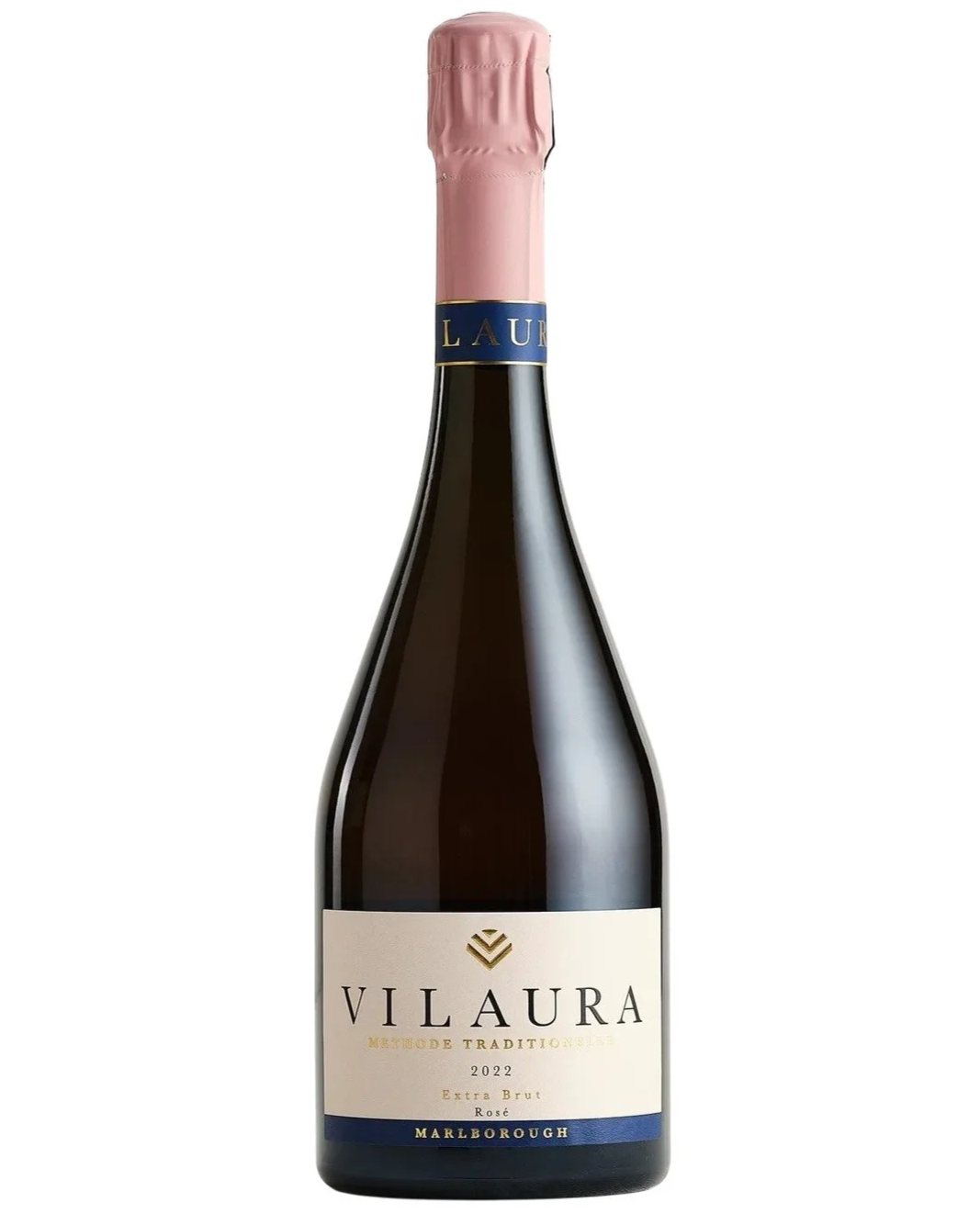
VILAURA - Marlborough Rosé Extra Brut Rosé Méthode Traditionnelle2022
The wine paired with Spring was the VILAURA 2022 Marlborough Rosé, disgorged in Spring and perfect for this artwork.
VILAURA is an independent New Zealand sparkling house founded outside the constraints of corporate winemaking. In just a few years, they’ve made a significant impact onf the local wine scene, collecting gold medals, trophies, and multiple Wine of the Show awards.
What connects Spring and VILAURA Rosé isn’t just effervescence…it’s energy.
Both the artwork and the wine move upward. Both feel light yet intentional. Both are expressions of independence and optimism, freshness and freedom, made with care and conviction rather than excess.
Together, they speak the same language … one of renewal, lift, and quiet joy. A pairing that doesn’t try to impress, but instead invites you to pause, look up, and feel uplifted.
- Renée Dale
—
RAY HAYDON
Seventy Five11th Nov - 7th Dec 2025
Sanderson are pleased to present the exhibition Seventy Five by Ray Haydon. Celebrating his seventy fifth year the exhibition explores the artist's dynamic and varied oeuvre spanning over two decades.
Haydon’s practice is celebrated for its deep engagement with the physical and conceptual properties of space. His works are held in many private collections worldwide, and have featured in major sculpture exhibitions in Aotearoa including NZ Sculpture OnShore, Shapeshifter Wellington, NZ Sculpture on the Gulf, and the Aotearoa Art Fair Sculpture Court. Haydon’s works have been featured in publications including Art News, Art New Zealand, ArtZone,The New Zealand Herald, Urbis, Denizen and Sothebys magazine.
—
Read more here.